Slated to raise £4k for Health Poverty Action (during the Pandemic), we were not inclined to solicit funds by simply asking with our hands out.
Given the unprecedented times, we found ourselves living, we experienced how complicated life had become; concerning personal finances and planning for the future. We decided to pursue alternative ways to raise the charitable contributions required to run the London Marathon.
We concluded to make a product that our audience could purchase and connect with - that relates to our lifestyle/training process, where each purchase would work as the supportive fuel that encourages us to complete the daunting 26.2 miles.
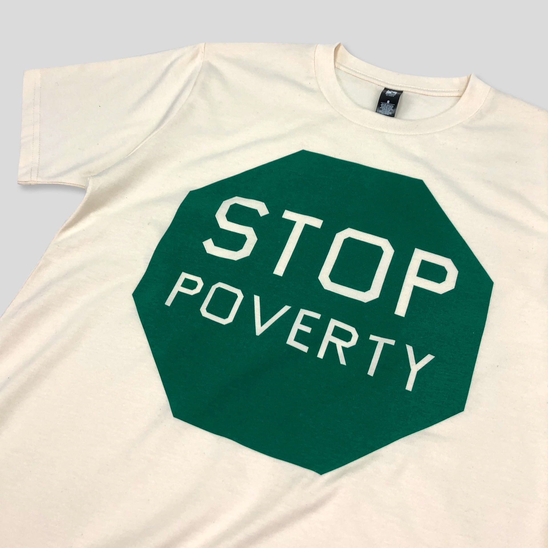
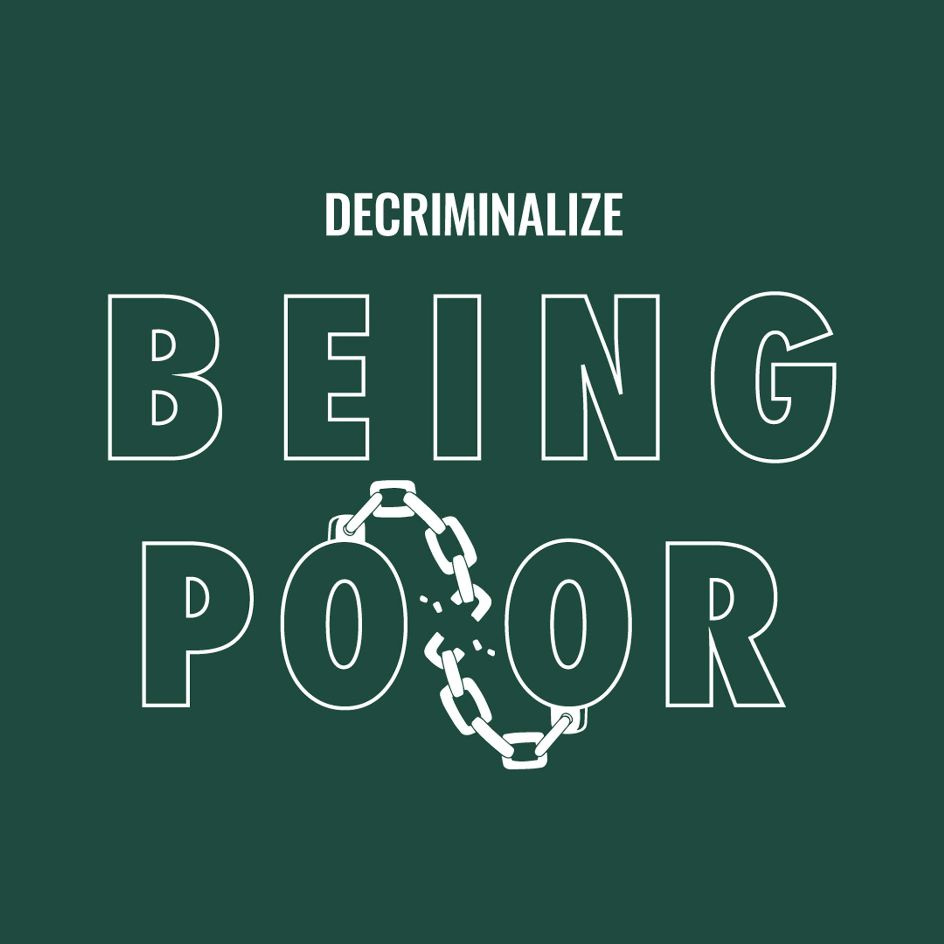
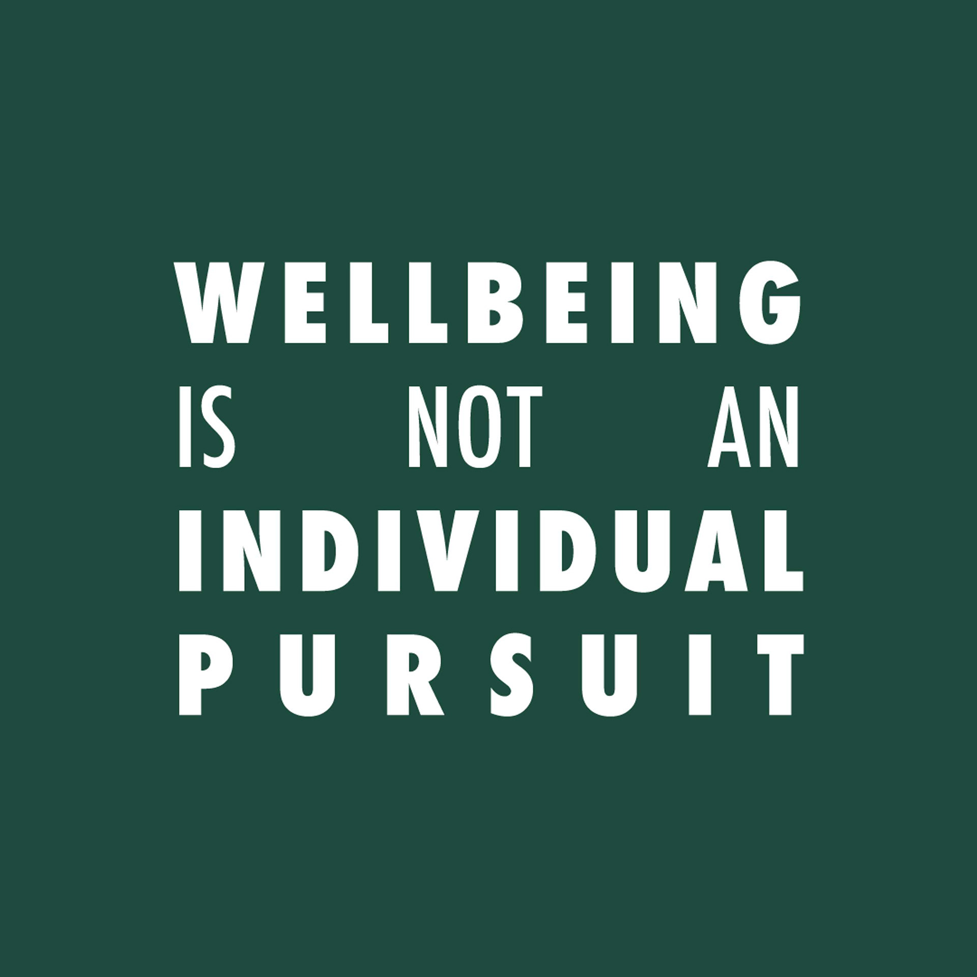
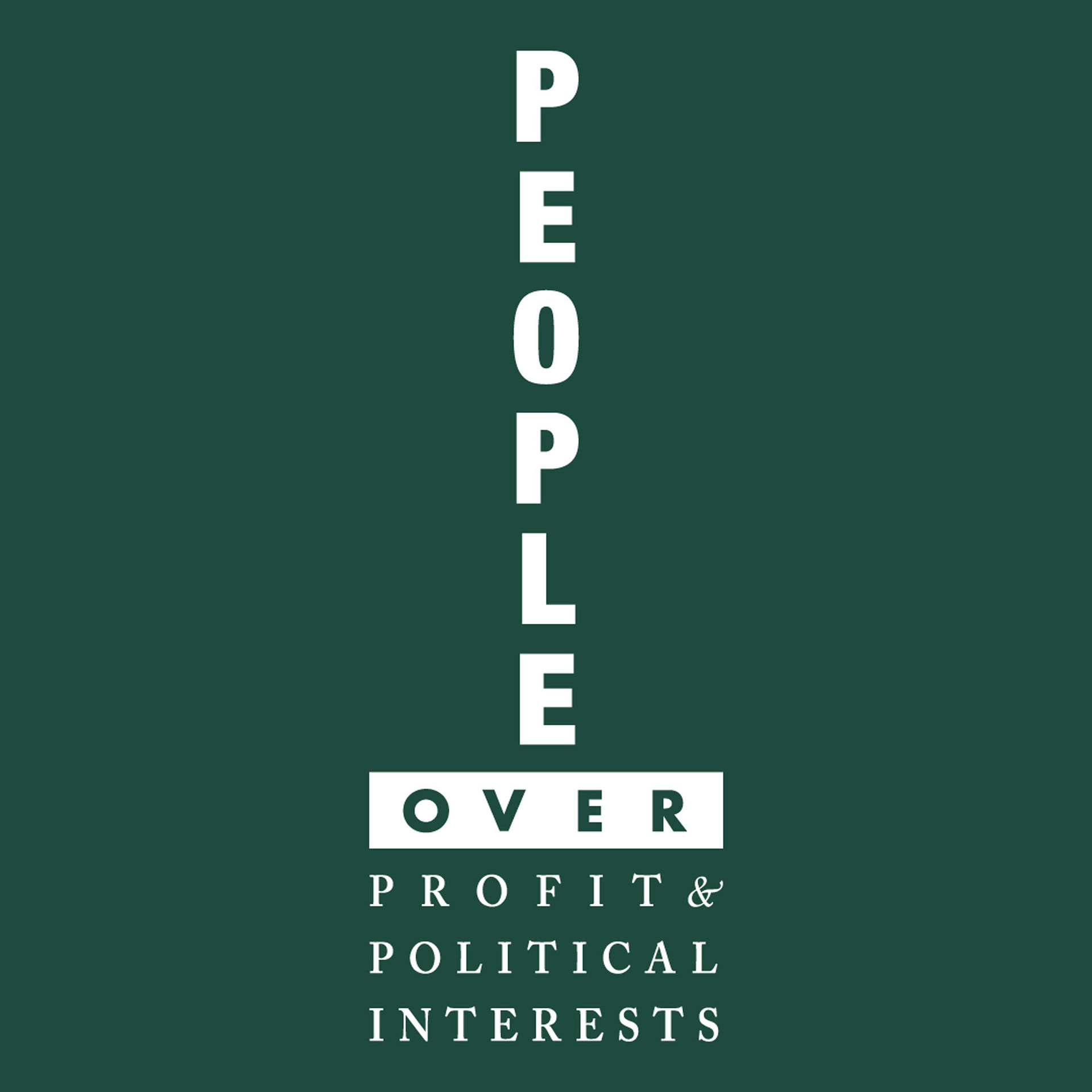
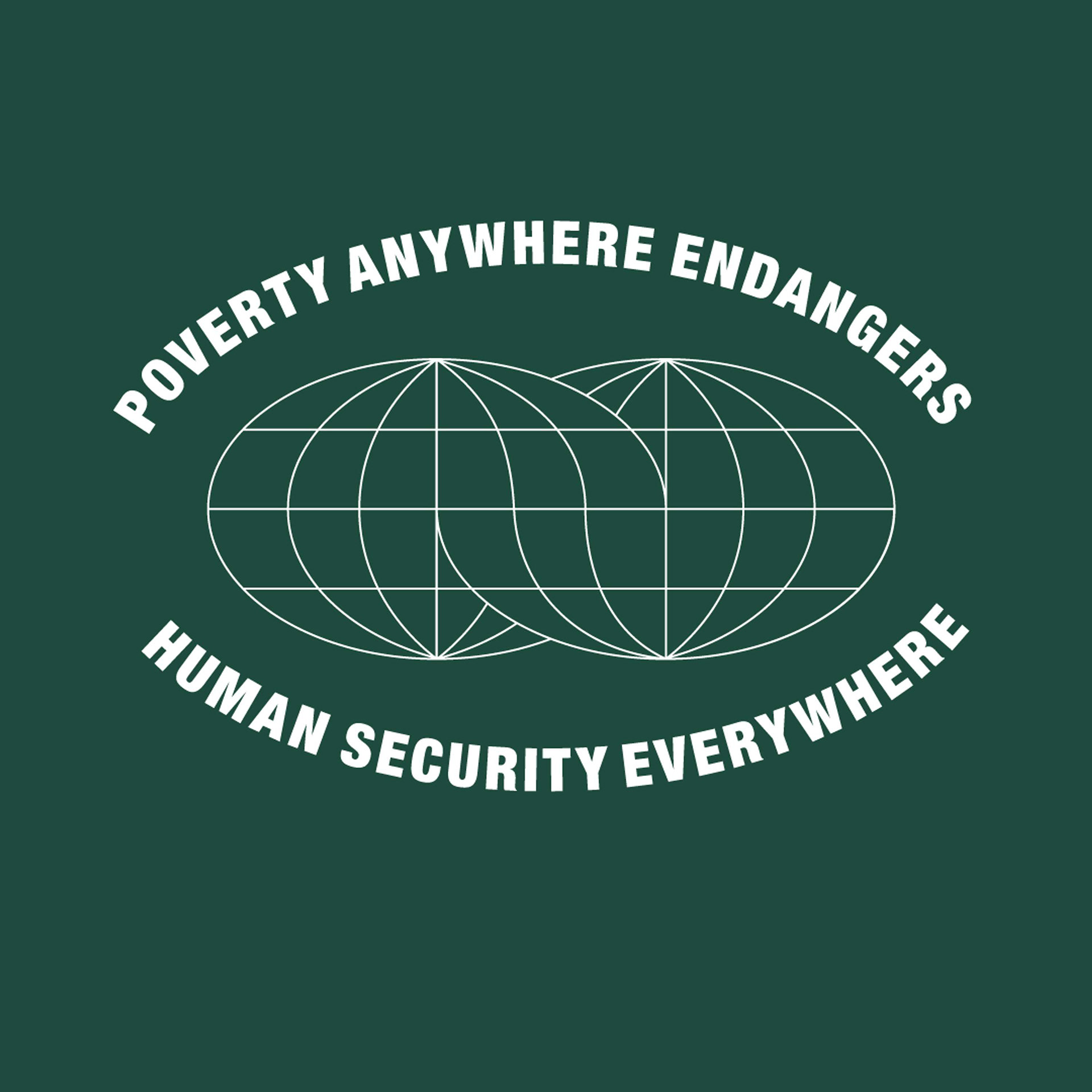
In the spirit of (brand) activism, we decided to produce a limited edition T-Shirt, splitting the message; something that raises awareness for Health Poverty Action and something that conveys our philosophy and aesthetic.
Our most successful idea was to remix the famous ‘STOP PRE’ shirt design (seen below). It is an informal typographic knocked out, set in a red stop sign shape. The shirt was made famous by running legend Steve Prefontaine after beating Gerry Lindgren circa 1972. Legend has it that Gerry had initially created the T-shirt and wore it to the race to taunt Steve.
We decided to amend the message, opposite the signification of ‘STOP’ inherent in the red sign, thus making the octagon shape green. We redressed the messaging to read ‘STOP POVERTY’ using an extremely homemade typeface Ed Ruscha calls Boy Scout Utility Modern, similarly styled to the original and appropriately vernacular.
We were able to foster a small community of runners to ‘GO’ out and contribute to Health Poverty Action's putting an end to poverty.
